Yellow isn't a color I use much, but I'm thinking I should change that. I just love the way the ochres and mustards work in these rooms.
Read MoreFireplaces understated and sleek
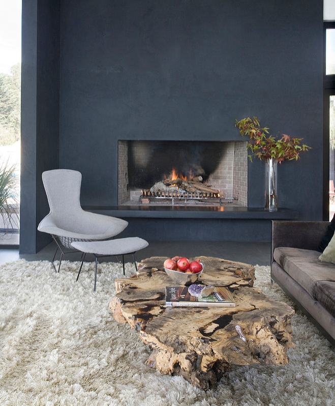
Lately I've been talking fireplaces, and I've found myself really attracted to this minimalist style: no tilework, no fancy surround. Just a simple opening with a plain front. I think this pared down, Scandinavian aesthetic is just so chic.
Read MoreSCD in Oakland Magazine: newest looks in kitchens
From my article in the latest issue of Oakland Magazine:
For years, white kitchens have reigned supreme. It’s easy to see why. They’re clean, bright, and tasteful; they’ll always be classic. But there’s a new kind of style on the block, and it’s closing in on the standing champ.
Want to know more about this shiny new look? Read on!
Read MoreKirkwood wallpaper by Thibaut
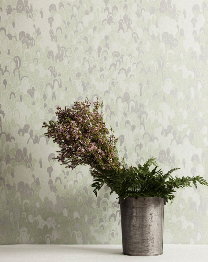
I love a jolt of whimsy in decor. That's why I was so pleased to come across this pattern when doing research for a client's dining room the other day. It's called Kirkwood, and it's from the Shangri-La collection for Thibaut, the venerable American design house.
Read MoreCoronata Star wallpaper by Osborne & Little
Have you ever noticed that tomato stems look like stars? I've eaten many a tomato in my time, yet this was still news to me. It struck me as utterly charming, this extra dose of beauty on an already pretty object. It also got me thinking that although stars are a lovely shape, I don't tend to use them often. So I went in search of a great star pattern, and this is what I found.
Read MoreGray works great for kids
One doesn't tend to think of doing a kid's room in gray. Kids rooms are fun, sprightly places, and that doesn't exactly describe gray. But gray is actually a great neutral. It's more unusual than white, and colors really pop against it, which makes it ideal for a kid's space. Dubious? Check this out.
Read MoreGeodes wallpaper by Flat Vernacular
This find is borne of a road trip. A road trip to California's central coast, specifically. We saw plenty of fabulous things, but it was the sardines at the Monterey Bay Aquarium that really captured my fancy. I was so inspired by their shimmering, glimmering quality, I had to track down a wallpaper that captured that effect.
Read MorePretty in pink
A new client pinned the image above, as inspiration for her young daughter's bedroom. I loved it immediately. Years ago I might not have said this. I've traditionally used pink in smaller doses, and pink walls: well, that's a whole lot of pink. But lately I've been really taken with this look.
So why do I find pink walls so appealing? Read on to find out.
Read More


