
A new client pinned the image above, as inspiration for her young daughter's bedroom. I loved it immediately. Years ago I might not have said this. I've traditionally used pink in smaller doses, and pink walls: well, that's a whole lot of pink. But lately I've been really taken with this look. I dedicated a whole Pinterest board to it, in fact.
So why do I find pink walls so appealing? Maybe it's because they feel serene, but not insipid. Neutrals look fabulous against them. And they're surprisingly versatile: they work in a bedroom for a young child, of course, but are even more interesting in a space geared for older occupants. In fact, I have it on good authority that their rosy glow makes a room's inhabitants look all the more youthful, much like one of those pink lightbulbs (which really do work, by the way).
Whatever the reason, I'm a fan, and I've collected a bunch of my favorites below.

photo by Clive Tompsett

design by Mette Helena Rasmussen & Tia Borgsmidt via nordicdesign.ca

design by Steven Gambrel via Elle Decor

via ethniccottage.blogspot.com
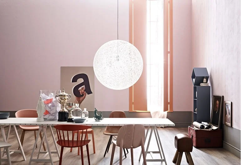
via schoener-wohnen.de

design by Ben Pentreath

design by Peter Dunham via House Beautiful

home of Christine d’Ornano via Vogue Australia Living
On board with this look? If so, keep a few things in mind.
1. Note that all the pinks I've shown are on the pale side: no bubblegum shades here! If you use a pale pink, it works almost like a neutral, albeit one with a sweet, friendly air.
2. Incorporate a lot of true neutrals into your room. Spots of other joyous colors work, but a fair dose of whites or natural tones are a must.
3. Don't forget a bit of black. You'll notice that every one of the rooms above uses a good amount of it. In a pink room, black not only offers visual contrast. It gives the space gravitas, and takes everything from childish to timeless.
So don't be afraid to think pink! Follow these steps, and you'll end up with a space that's both joyful and serene, and altogether sophisticated, too.