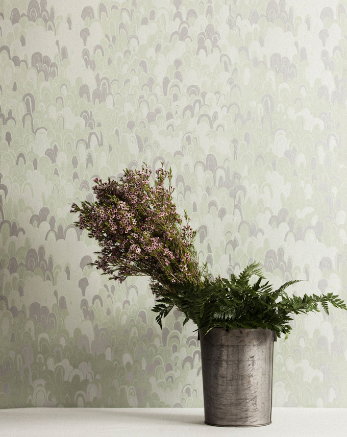
I love a jolt of whimsy in decor. That's why I was so pleased to come across this pattern when doing research for a client's dining room the other day. It's called Kirkwood, and it's from the Shangri-La collection for Thibaut, the venerable American design house.
Read MoreCoronata Star wallpaper by Osborne & Little
Have you ever noticed that tomato stems look like stars? I've eaten many a tomato in my time, yet this was still news to me. It struck me as utterly charming, this extra dose of beauty on an already pretty object. It also got me thinking that although stars are a lovely shape, I don't tend to use them often. So I went in search of a great star pattern, and this is what I found.
Read MoreGeodes wallpaper by Flat Vernacular
This find is borne of a road trip. A road trip to California's central coast, specifically. We saw plenty of fabulous things, but it was the sardines at the Monterey Bay Aquarium that really captured my fancy. I was so inspired by their shimmering, glimmering quality, I had to track down a wallpaper that captured that effect.
Read MoreShadow Puppet wallpaper by Paper Boy
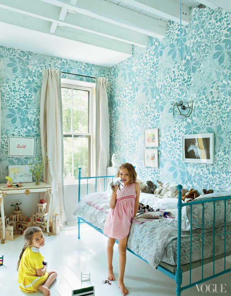
At some point awhile back, I pinned a photo of this wallpaper, from British company Paper Boy. Called Hand Made, it's a graphic pattern made with shapes of shadow puppets. Upon seeing it on my kid room board this week, I found myself charmed all over again, and decided to take a closer look at it.
Read MoreWallpaper by Marthe Armitage
If you thought this gorgeous wallpaper was devised by a firm run by hip young things, you'd be mistaken. It's the work of an awesome British lady, but she's no spring chicken. And her papers are taking the design world by storm.
Read MoreA Stone's Throw Away wallpaper by Hygge & West
While doing research for a magazine article recently, I came across a great new resource: wallpaper from Hygge & West. If you tend to think of wallpaper as fusty, this place should change your mind.
Read MorePretty powder rooms
Known as "half baths" in real estate speak, powder rooms usually contain only a toilet and sink, and they're often quite minimal in square footage. That's no drawback, though. Precisely because they're tiny, you can go all out when designing one. So let's take a look at some beautiful examples, and then I'll break one down for you, so you can see why it works so well.
Read MoreLeafy love
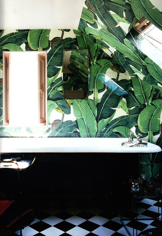
It's a lot less green out there, even here in sunny California. And so I find myself drawn to things that remind me of spring, like these amazing tropical leaf prints. They're wild and fecund and altogether fun. This boldness makes them a bit tricky to work with, though. But fear not: I've got tips for you on how to use them. Read on for some leafy inspiration and education.
Read More


