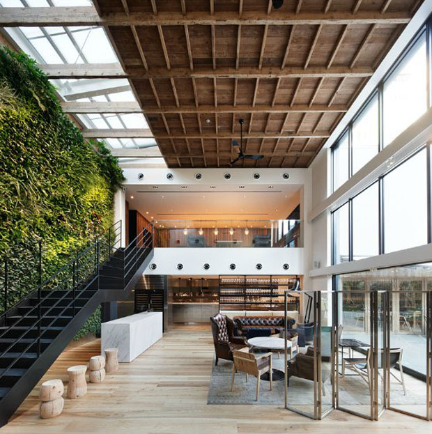
I love a good houseplant.
They connect your space with the outdoors, freshen the air inside, and
are an easy way to add life and texture to an empty corner. Living
walls do houseplants one better. Call them the wild child of the potted
kingdom. Read on to learn more.
How to make the best kids rooms
Designing a space for children is about more than using their favorite color or letting them pick their bedding. It’s about creating a room that takes into account their size, their mobility, and their interests. It gives them space to express themselves, and a place to feel both comfortable and inspired. Here’s how to do that.
Read MoreCrate & Barrel Designer Custom Challenge
This year I discovered a particularly fun design competition: the Crate & Barrel Designer Custom Challenge. I had a great time designing my chair, which I think is a nice blend of bohemian and chic. But did the judges agree? Read on to find out!
Designer chat back: Peter Krask
I've been fortunate to meet all sorts of wonderfully interesting people during my time at the Today show, including Peter Krask. He's been the residential floral designer at the show for over fourteen years, and is the recipient of an award from the American Institute of Floral Design for his work there.
Recently we discussed how he got started in the biz, what inspires his palettes, and why novices should avoid tulips.
Read MoreHouse numbers, Brooklyn style
Here in brownstone Brooklyn, nearly all of the buildings are over a hundred years old, and many of them have some pretty remarkable house numbers. Some are etched into the sides of the buildings. Others use tiles attached to the steps. And many were hand painted on door glass decades ago. Following are some of my favorites.
Read MoreDesigner chat back: Kate Hayes
With work in New York City, Westchester, Abu Dhabi and Atlanta, Kate
Hayes is constantly on the move. Recently I sat down with the
Brooklyn-based interior designer to discuss her work process, her dream
project, and her plans to open an Atlanta office.
A color story by Alexander Doherty
I consider myself a big fan of House Beautiful magazine. It’s a lot more meaty than many of the other design mags, and in the absence of Domino (RIP, friend), it’s definitely my favorite.
One of the best stories in there as of late is the profile of an Alexander Doherty project in Manhattan. I was totally unfamiliar with his work before reading this piece, and I’m so glad that’s no longer the case. I love this work in part because it isn’t like anything I would ever think to do, and I always love a good kick in the pants when it comes to design ideas.
Read MoreMy favorite design advice
I try to follow this rule in my own home, and I encourage every one of
my clients to do the same. It's a surefire way to rid yourself of
clutter.
This isn't to say that William Morris
is a minimalist--far from it. In fact, he's a genius with lushly
detailed decor. He may have done most of his work in the mid to late
1800s, but it can still feel so fresh. And you know Will and I both love
a good pattern mix.


