
I consider myself a big fan of House Beautiful magazine. It’s a lot more meaty than many of the other design mags, and in the absence of Domino (RIP, friend), it’s definitely my favorite.
One of the best stories in there as of late is the profile of an Alexander Doherty project in Manhattan. I was totally unfamiliar with his work before reading this piece, and I’m so glad that’s no longer the case. I love this work in part because it isn’t like anything I would ever think to do, and I always love a good kick in the pants when it comes to design ideas.

photo by Francesco Lagnese via House Beautiful
What speaks to me most about this project are its colors. Doherty says the palette was inspired by the newly renovated 19th century galleries at the Met. He suspected that the walls there were custom tinted, but that turned out not to be the case. The paints were by Farrow & Ball, and the Met was perfectly happy to tell him so when he asked.
Two lessons here: inspiration can come from anywhere. And don’t be afraid to ask the origin of something you like. You just might be surprised by how easily you can recreate it.
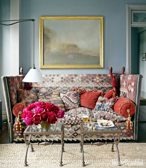
photo by Francesco Lagnese via House Beautiful
I tend to gravitate towards more contrast in my own work, but I’m really taken with how gorgeous these rooms are in their subtlety. The colors are so gentle and serene, but they’re not in the least boring. They occupy someplace between a bold color and a pastel. Writer Douglas Brenner calls them “foggy,” and that seems apt. They’re both complex and muted. I especially love this bedroom combination.

photo by Francesco Lagnese via House Beautiful
It’s not just the wall colors that make everything harmonize so well. It’s also the way Doherty handles the trim in the room. He doesn’t use the customary white paint for this, often preferring instead to use a tint that is extremely close to the wall color. It’s another touch that adds a dose of harmony to the space.
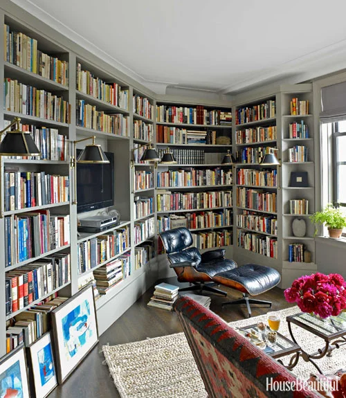
photo by Francesco Lagnese via House Beautiful
Read more about it in the December/January 2013 issue of House Beautiful. And check out more of Doherty’s work here.