I've been scoping out lots of dining rooms lately, doing research for some new clients. They want to incorporate their existing table and chairs in the design. It's a matched, formal set: pretty, but rather tame. So I came up with an idea to make it more lively and unique, and perfectly suited to the young family that lives in the home.
Read MoreDeck the walls: photography by Jon Siegel
I'm excited to share with you today the work of Jon Siegel. Jon is an American expat based in Singapore. He works as a creative director for a digital agency by day. By night, he uses his camera to immortalize the streets of his adopted home. I spoke with him recently to discuss why he took up photography, the evolution of his style, and how he captures his subjects on the sly.
Read MorePoppin makes for a pretty workspace
I design my fair share of professional workspaces. So I'm always on the lookout for good looking office items, everything from chairs and file cabinets to paper trays and pencil cups. Last week, I came across a new vendor: Poppin. It offers shoppers a shortcut to a visually cohesive space, and with a great price point to boot.
Read MoreWallpaper by Marthe Armitage
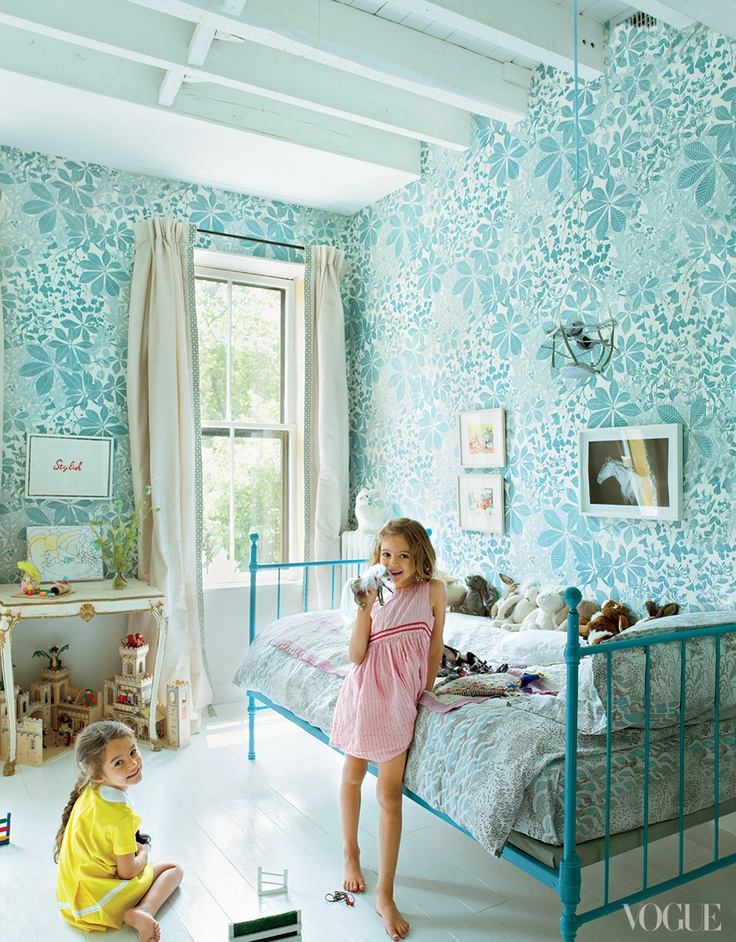
If you thought this gorgeous wallpaper was devised by a firm run by hip young things, you'd be mistaken. It's the work of an awesome British lady, but she's no spring chicken. And her papers are taking the design world by storm.
Read MoreDeck the walls: art by Jill Galloway Sherman
I'm excited to share with you today the work of my friend Jill Galloway Sherman. The Philadelphia-based artist originally trained as a sculptor and photographer, but counts many mediums in her skill set, including drawing and book design. We spoke recently to discuss her career path, her sources of inspiration, and the direction of her newest work.
Read MoreMaharani wallpaper and fabric by Osborne & Little
I'm fortunate to have a great side gig: I write about interior design and style for Oakland and Alameda Magazines. One of the most fun parts of that job is suggesting photos to accompany my articles. When doing research for my most recent assignment, I came across this wallpaper. The pattern is called Maharani, produced by the legendary design house Osborne & Little. It also comes as a fabric, and they're both pretty amazing.
Read MorePalette inspiration: the art of Mary Blair
The other day, we grabbed the kids, packed a picnic, and headed out to the Presidio. I thought we'd scope out the view of the Golden Gate Bridge, enjoy some redwoods, and maybe toss a ball on the wide grassy fields. When we got there though, we saw signs for something that made my husband draw in his breath: an exhibit on Mary Blair, the extraordinary Disney artist. As I looked at her work, I was struck by her masterful use of color. It occurred to me that any one of her pieces would serve as a great palette for a beautiful room. Check out these pairings.
Read MoreSCD in Oakland Magazine: make a pretty powder room
From my article for the latest issue of Oakland Magazine:
Does this sound familiar? Years ago you bought a great house. It has a sunny living room, a sizable yard, and enough bedrooms to fit your family. There’s just one problem: It could really use another bathroom. You’d consider moving to a bigger place, but with the market the way it is, that’s not an option. And you just can’t stomach the thought of a major renovation. So what to do? One solution will make your day-to-day much easier and substantially increase your home’s value: adding a powder room.
Want to learn how to make a half bath that's both functional and stylish? Read on to find out how.
Read More


