
I'm a huge fan of Pinterest. I spend some time on it everyday, checking out photos of interiors for inspiration. (You can follow me here!) But when it comes to designing rooms, other rooms aren't the only muse. An old painting, a favorite blouse, even that vegetable patch in your backyard: they're all great sources for color palettes.
My most recent dose of inspiration came about on a visit to the Japanese Tea Garden in San Francisco's Golden Gate Park. The pagodas, Buddha sculpture and bridges were all stellar, but I was really taken with the foliage and ponds. They're full of some surprising--and great--color combos.

Take this vista, for example. I hadn't yet seen it when I designed the space below, but the palettes are very similar. And just as it is pleasing in nature, it's pleasing indoors, too.

Brooklyn residence
So don't be afraid to mix red and green! It doesn't have to feel Christmasy, especially when there are lots of other neutrals in there.
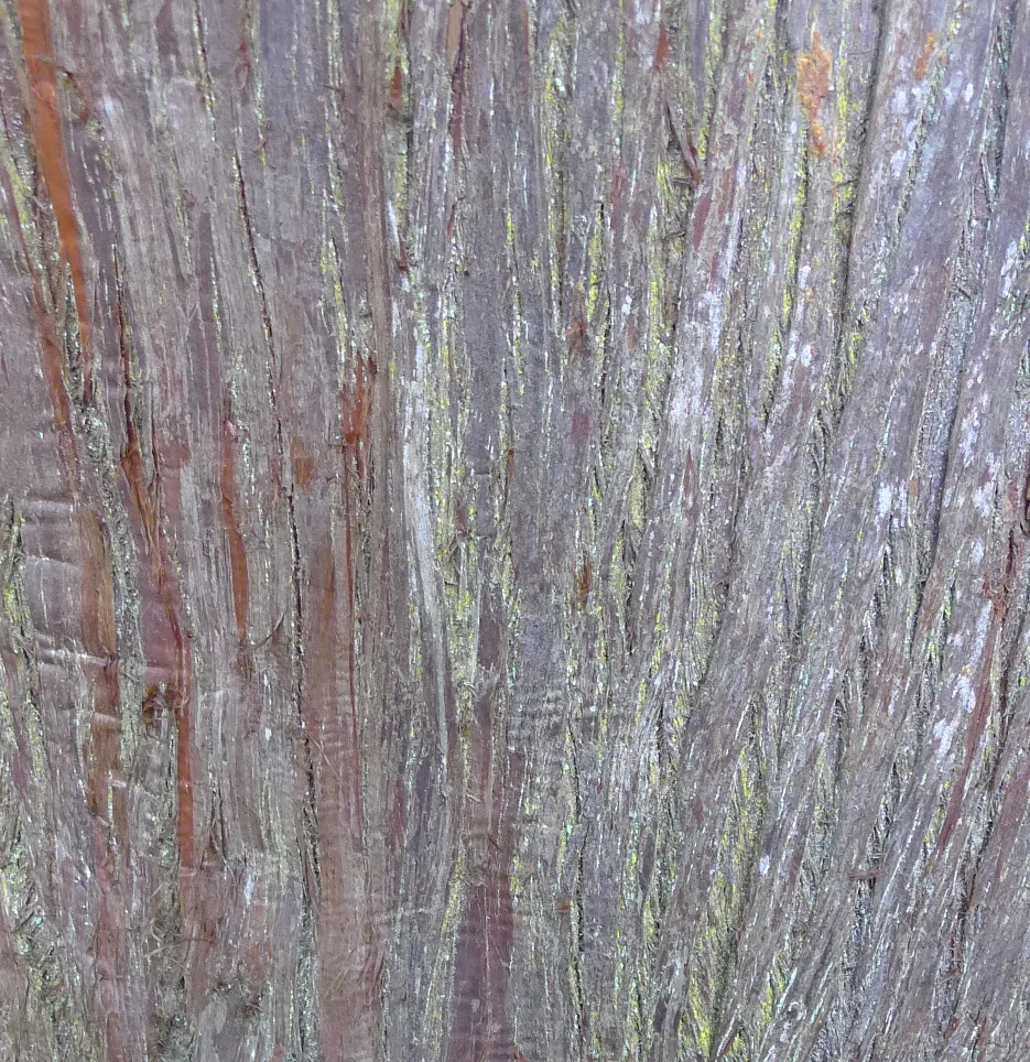
Other sights I loved? The purples, grays, browns and yellows in this tree bark. Surprising, subtle, and gorgeous. And something I never would have thought to do if I hadn't seen it work so well here.
The pinks, greens, blacks in this flowering bush: both classic and dramatic.

And the greens, yellows, blues, and browns in this view of a ginko tree. Fantastic!

Nature rarely leads you wrong, folks. So the next time you find yourself moved by a beautiful sight, snap a photo. Your home will thank you later.