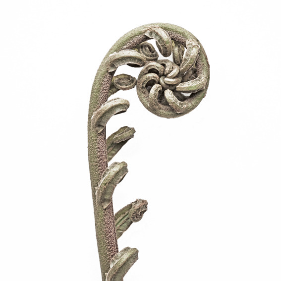
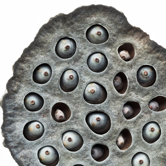
I'm in the final stages of a dining room project. The drapery is trimmed; the walls are painted an absolutely lovely shade of blue; and the chairs are upholstered in a fetching combo of fawn and lipstick pink. All that's left is to select the artwork.
The room is refined--classic but not stuffy--and I want the art to feel the same way. Knowing my client's style preferences and the color needs of the room, I decided botanical prints were our best bet. They're beautiful, sure, but that's not what makes them special. It's their scientific bent. I think it gives them a hint of seriousness, and ensures that they feel smart, not precious.
While researching various options, I stumbled on a new take on the genre, and was instantly smitten. The prints are made by Francis Ooi, who sells them through his website whatiseewhenirun.com. He explains the origins of his company name thusly (and rather charmingly, I think):
When Francis Ooi leaves home, telling his wife he's going for a run, he's obviously lying. Because he walks more than he runs. And he's never out of breath either. Otherwise he'd never spot his breathtaking subjects on the pathways of Singapore.
But let's not be too harsh on Francis - for his lack of focus outdoors, is our gain in beauty indoors.
He continues:
Inspired by the botanical illustration of the past, this is the modern interpretation. Armed with only a micro four thirds camera, Francis shoots many flora wherever he goes. Due to the camera format size, the largest size he will print is A1, without having the resolution breaking up.
Why the micro four thirds format instead of a bigger format? Simple. A bigger format camera certainly captures more details. More details in this instances is not necessarily a good thing. It's like watching the latest hi-definition flat screen TV with super sharp details which hurt the eyes.
The current format on matt[e] paper plus his treatment produces a nice fine grain thus giving it an illustration look rather than a photograph . . .
A1 size translates to a little over 23" x 33". Not huge for sure, but not tiny either, especially if matted and framed. They're available in smaller sizes too, and, like most botanicals, they're at their best when hung in groups.
Because they're photos, the pieces are realistic. But since the resolution of the images isn't super high, and since the paper he uses is matte rather than glossy, the overall effect is really unusual. They remind me of hyper-technical illustrations, or maybe really artistic photos. Whatever you want to call them, they are certainly gorgeous.
All the prints are signed and numbered, which lends them an extra element of specialness. They're well priced too, for such lovely work.
It's rare to find something that breathes new life into an old genre, but these botanicals do just that. And they may be just the thing that dining room needs.


